Sensuous / Estée Lauder

15 Nov

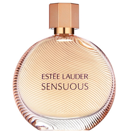
Sensuous smells exactly like its namesake; this is one of those linear fragrances that don’t evolve very much but it smells so amazing that it doesn’t matter. This was close to becoming my signature scent, but I found it rather difficult to wear on a daily basis. It’s something that I reach for at night, after a hot shower…before bed, or for a quiet evening out with my husband.

Sensuous starts with a blast of sandalwood and cedar, these are the primary notes that can be picked out amongst the mellowing warmth of honey and amber. I sense a little pepper in between but it complements the woodiness of this fragrance so well that you can hardly separate the two. There is a bit of orange on the cool down which invokes a clean powdery feeling to the structure of this perfume. With the exception of ylang-ylang, I did not detect any florals.

I consider Sensuous to be one of my top five powdery fragrances, it’s unlike anything I’ve ever smelled before and I feel this is due to the unique nature of its ingredients. The honey and amber radiates with warmth and sensuality, it reminds me of silk sheets and vanilla body cream, very luxurious and decadent. At its heart this is a boozy powder with balsamic undertones and hints of warm incense.  It’s very feminine but not immature; this is unequivocally a woman’s fragrance.
Overall I am consistently enamored with Sensuous; as the seasons shift into December I find myself embracing it like a warm blanket before a roaring fire. I can imagine this to be a perfect companion for autumn and winter. Sillage and longevity are moderate, this is a skin scent meant to entice and seduce with ease; apparently it works…I am constantly under its spell!


Top Notes

Middle Notes

Base Notes

London for Men / Burberry

31 Oct

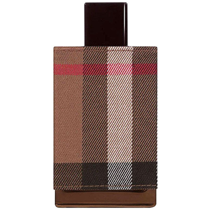
I have come to the conclusion that men’s fragrances can be much more complex and pleasing to the palate than the average woman’s winter lineup. My latest excursion with Burberry London has proven that perfumes are multifarious in nature, genderless and will appeal to practically anyone who can wear it with love and confidence. This is the perfect fall companion, much like a trench coat on a brisk Autumn day.

London opens up with strong cinnamon and tobacco notes; there is leather at the base and mild citrus to keep this feeling fresh. The bed of oak moss is what gives this perfume a very damp earthy scent that rounds out all the other notes. It smells like wet soil mixed with fresh lavender after a heavy rain. The cinnamon stays true through dry down along with a very surprising scent of roses, the tobacco is still there but it’s become softer and more sentimental. To me this is Thanksgiving in a bottle: warm, spicy, and reminds me of my grandfather’s library.

London is not a tough guy’s fragrance, in fact I feel this is more for the aristocratic gentleman; the kind who is a little old-school, has his head on straight, and doesn’t pussyfoot around the bedroom ;). He is strong willed and non-conventional, a straight shooter who is as likely to break your heart as he is to brighten your day with a soft kiss. On women this is strong, confident, and a slightly bitchy. I totally feel like I am channeling Lauren Bacall with a little whiskey and a cherry cigar. London fantastically transcends gender barriers and I love it.  ♥


Top Notes

Middle Notes


Base Notes


Rosabotanica / Balenciaga

31 Oct

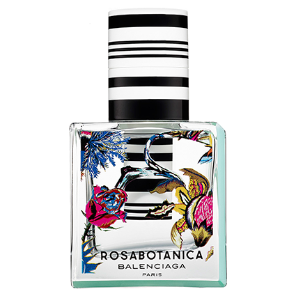
I’m surprised mint was not listed as an ingredient on this; there certainly seems to be some kind of bitterness accompanying the rose and fig opening of this fragrance. Rosabotanica is a very green scent, I feel like I am standing in the middle of an English garden after a heavy spring shower, basking in the aroma of fresh flowers and wet grass. The dry down consists of cardamom, woods, and a very sheer rose. There is pepper throughout its life but I also sense a little saffron as well; grapefruit balances everything out to make this a very clean and energetic fragrance.

Rosabotanica isn’t particularly innovative; it’s a streamlined fragrance with a little twist. There’s something here that reminds me of Agent Provocateur, the rose is an Indian rose…not your conventional evening flower. I am absolutely in love with the dry down after about an hour, pink pepper balances so well with the florals that it’s a shame how soft the sillage is. It’s certainly a skin scent, with almost no projection and poor longevity.

Overall not exactly a game changer, but still very memorable and the bottle design is pretty enough to make it almost worthwhile.


Top Notes

Middle Notes

Base Notes

Victorian Coffee

19 May

I love coffee, but I am a major wuss so I settle for novelty brands (Baskin Robbins’ Cappucino Blast…mmmm). My husband can attest to all the situations in which an argument has subsided with one phrase: “Let me get you some coffee”. He is a dream, no wonder I married him ;).

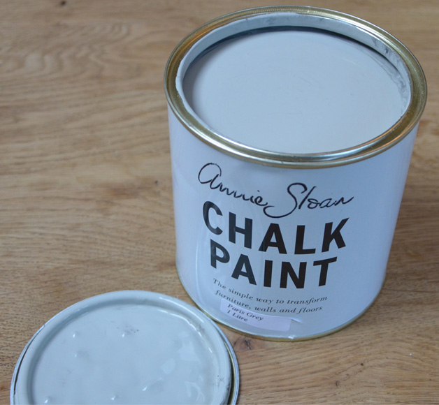
Today, I wanted to share a coffee table that I painted with Annie Sloan’s Paris Gray.

I compared this color with Behr’s Sparrow according to this chart here. It turned out to be a perfect match! Now I know where to get ASCP colors without the price tag.

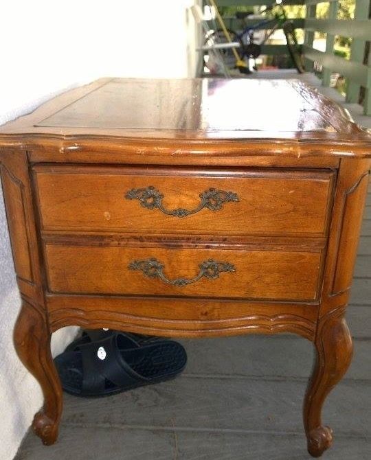
On with the story, I found this table on Craigslist for $20. It was initially meant for my living room, but upon seeing it in person I found out that the table was too short.

I decided to take her home anyway, because i knew she had potential. Plus her curves were too pretty to pass up.
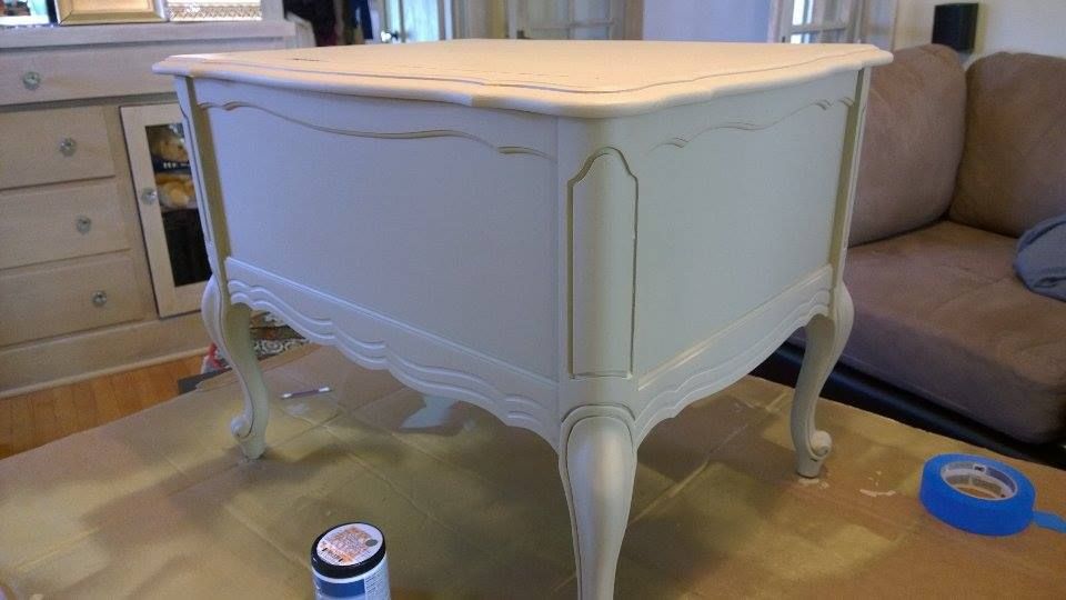
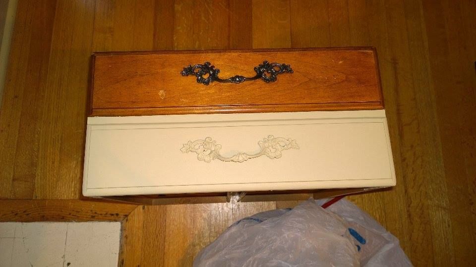
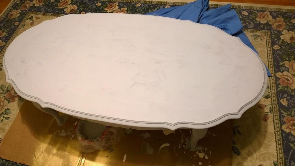
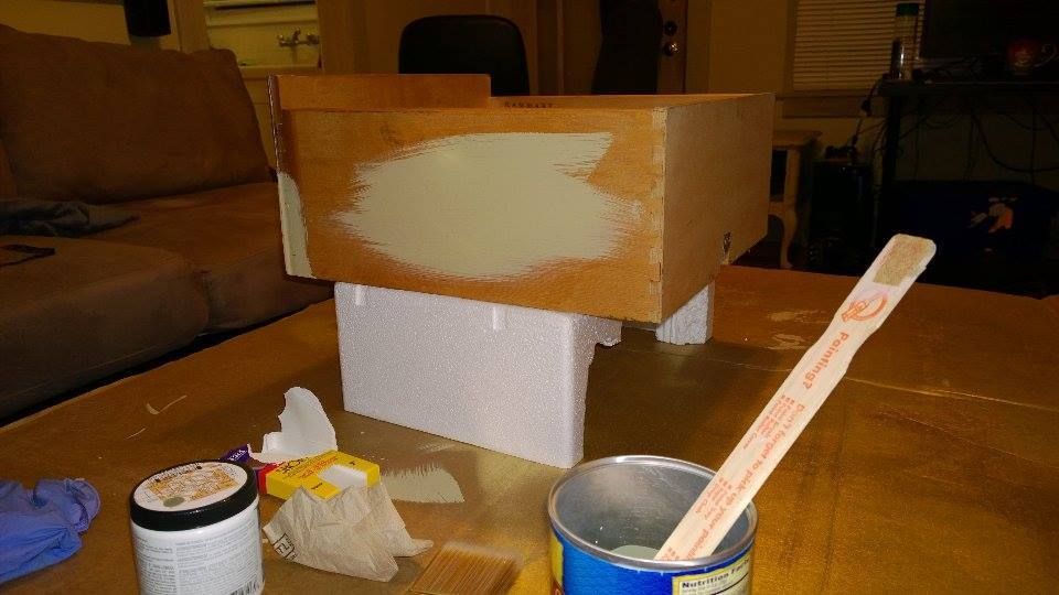
I decided to mix some of the Paris Gray with Old White because I wanted a delicate grayish cream color.

It went on so beautifully! A very light grayish blush.

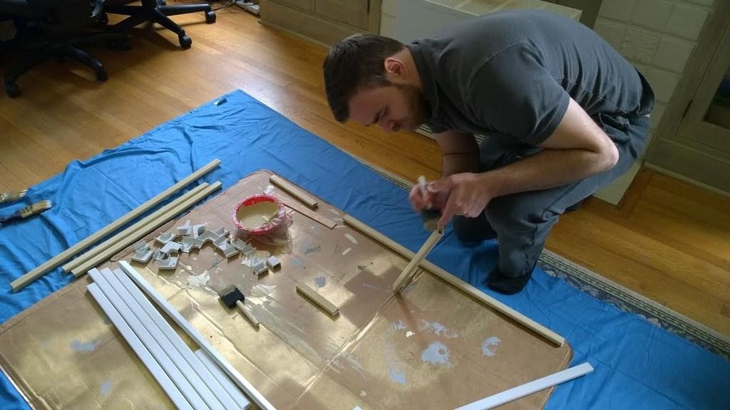
It’s so funny because during this entire time I got my husband to paint some of the wire tubings that we recently purchased for our place. It was a fun bonding experience, who’d knew?

Since chalk paint dries so quickly, I was able to distress her within one hour.

I used 220 grit paper and started to sand while the paint was still soft.

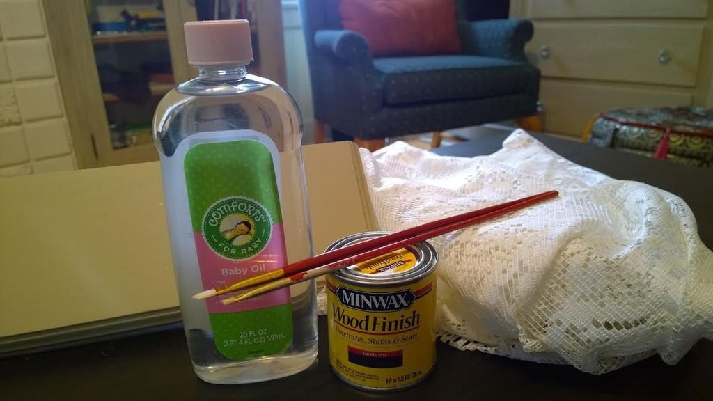
So at this point, I wanted to try something a little different. I read on this blog, that you can use baby oil and wood stain to achieve a distressed look while maintaining the original color. Let’s just say I tried this technique and it was a major disaster for me.

I had no idea how much stain I needed to apply, how long to wait between wiping, and how much to remove. Either way, I will probably try this method again but with a lighter stain color.

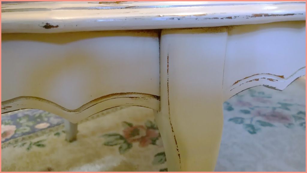
Beginner Tip #1 NEVER.. EVER sand your table in a circular motion. I made this horrible mistake when sanding the edges of my table, and after using the stain, it crept into the wood and left a dark gray color that is very noticeable! Always sand in the direction of the grain, I don’t know why I didn’t do this to begin with.

Beginner Tip #2 Unless you are going for a super chippy look, try to hold off on over-sanding and distressing. The results could be disastrous and unnatural.

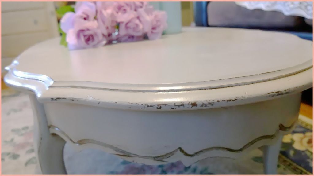
Seeeeeee? See what happens when you go overboard? It looks unnatural.

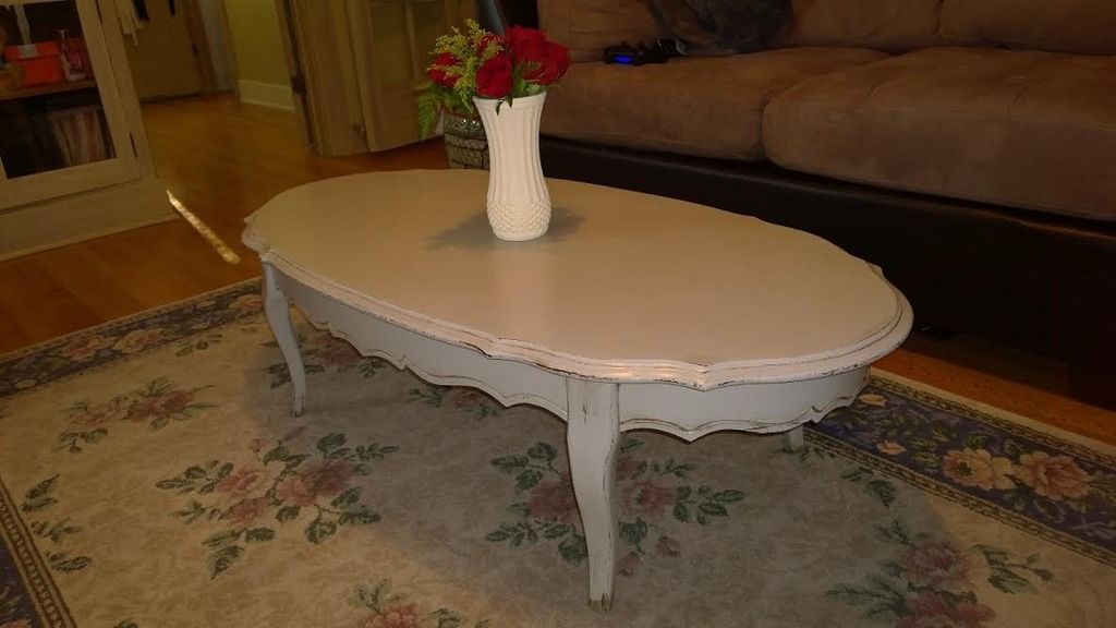
And here is the finished result.


New Love

18 May

When I first discovered furniture painting, my mind didn’t immediately go to all the crazy things I could refurnish in my house. Instead, I thought about all the sad lonely items that are thrown away, discarded, and destroyed each day in our country. Items that could have otherwise been renewed, redeemed and revived. The idea of transforming something old into something new again gave me a strange kind of hope, perhaps I was projecting myself a little bit through my art projects? Either way it is a beginning of a journey that has brought me a lot of happiness and satisfaction. It is no longer just a weekend hobby, it has become a passion of mine. My house has become a haven for homeless furniture, my clothes are covered in paint, and my porch is cluttered with paint brushes. Yet being the neat freak that I am, I find myself enjoying the “artistic” mess.


This was my first project, a sad lonely table that had beautiful shape. I was rather nervous at first, I have no idea what I was doing! Either way, I just told myself to paint and so I did.

I mixed up my own version of chalk paint using the 1 plaster of paris to 2 paint ratio. The color went on so smoothly and finished so cleanly that I knew this would be my default technique.

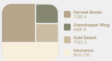
I decided my colors were going to be Harvest Brown for the body and Grasshopper wing for one of the drawers. It’s funny because there is technically only one drawer while the other one is purely for show. I had to use tape to separate.

By the way, I’ve discovered that DIY chalk paint dries extra fast! This table was ready to be distressed within one hour. Amazing.

I was impressed by my taping skills the very first time, go me!

I used Rust-oleum rubbed bronze spray paint on the handles!

After everything was dry, I started to distress the table and drawers with 220 grit sand paper. I wanted to try something different instead of making both drawers the same.

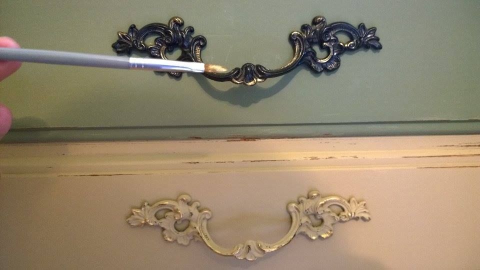
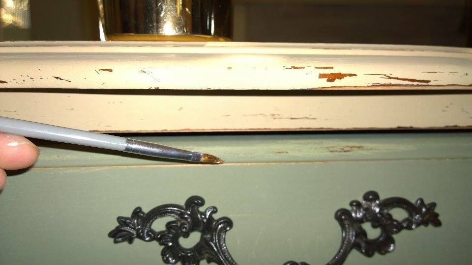
The next day I sprayed some gold metallic paint into a can, and using an artists’ brush, I carefully drew some gold lines on the handles and the distressed parts of the table.

This made it so that when the light touches certain distressed parts of the table. It would give off a golden gleam. I am obsessed with anything gold so this part was totally necessary! 😉

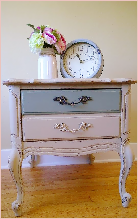
Here is the resulting table!