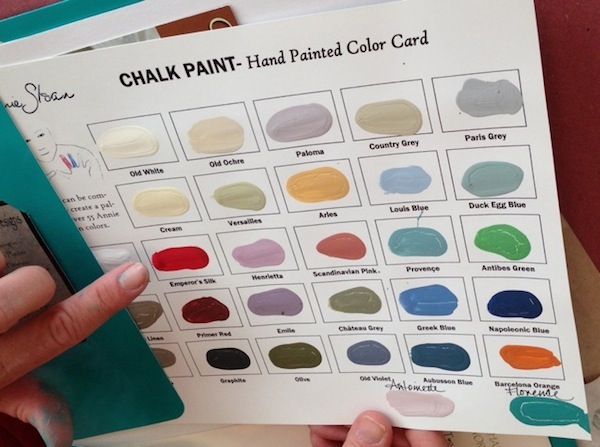
I love Annie Sloan paint, however I am not always a fan of her prices. Chalk paint is currently the “in” thing these days, but after using her paint and creating my own DIY mixtures, I really do not see a difference. Honestly, whip up a batch of Plaster of Paris with any of the Behr colors that match ASCP’s and put them side by side…the difference is nil to nothing.
I know there is already a list out there that matches Behr colors to Annie Sloan’s but I realized after doing some research that the list is A) outdated B) the colors are not precise and do not match.
I wanted to do a very thorough and close match to ASCP’s colors. The colors I’ve researched are not just “similar”, they also match undertones and overtones. Thus, the colors are as close to authentic as possible.
Pardon my finger haha
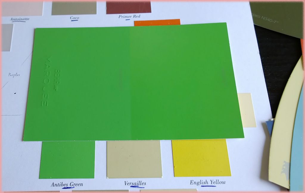
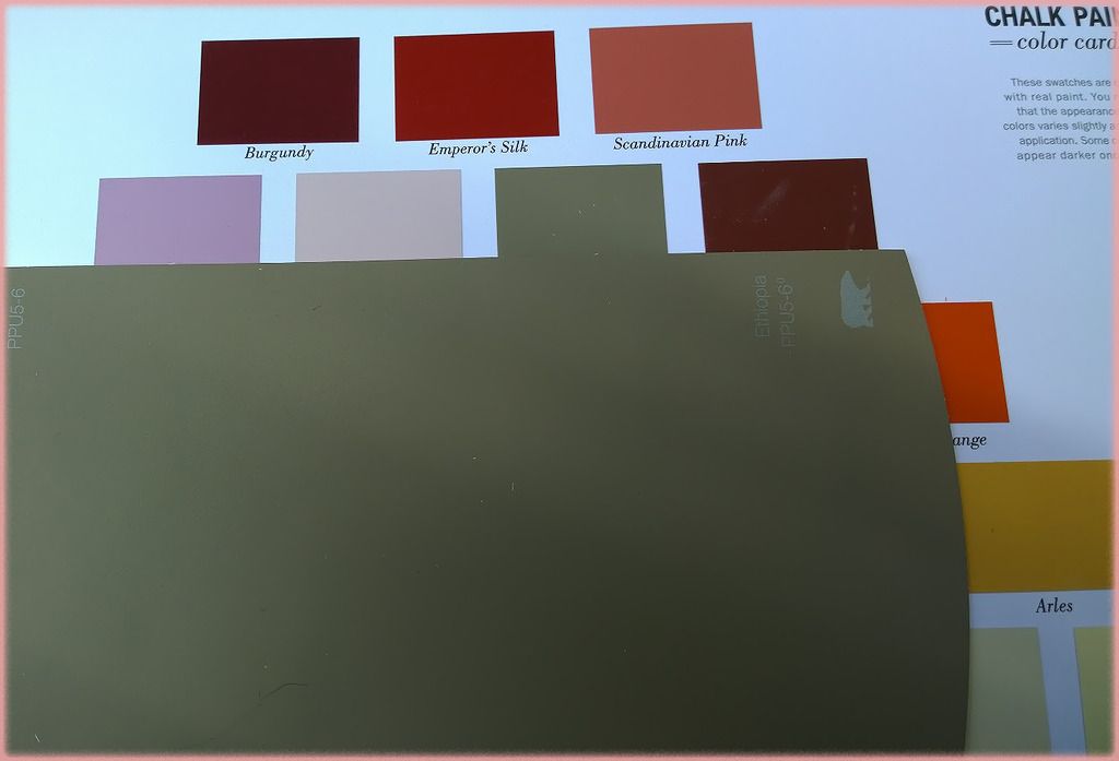
Antibes Green matched with Behr’s ParakeetASCP’s Coco matched with Behr’s Ethiopia (camera lens makes it look a little green, it’s actually brownish cream).
In some cases when a Behr color is not possible, I matched it with Glidden or Ralph Lauren paints. All three brands are carried by the Home Depot and are affiliated with each other. Home Depot can transform it into a Behr “color” by using their color match system.
**So for example the closest match to ASCP’s Barcelona Orange is Ralph Lauren’s Varsity Orange, you can turn it into a Behr Premium Plus Ultra brand by letting the associate know the name and number of the RL color. Simple!**
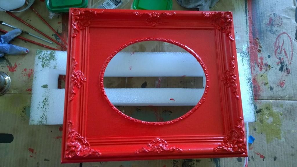
Quick update, my mom found these dirty frames when cleaning out her garage. I LOVE gold anything and these things had little ornate details that I knew could transform into something cute.
So dirty and gross!
First, these were covered in cobwebs and dirt, so a much needed scrubbing was my priority. I filled up my bucket and with some water & soap…I managed to get some of that yuckiness out. =P
What a difference! =P
So to prep, I decided to prime the frames with some 1-2-3 Primer I bought from your local Home Depot.
I then started to paint with Glidden’s “Winter Mauve” on one frame and Behr’s “Indiscreet” on another.
I allowed the frames to dry over night. The next morning I started the staining process; I’m still new to this staining thing but after my last project I have started to gain a little more confidence.
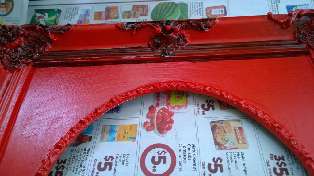
With an artist’s brush I applied the stain in little nooks and crannies, making sure to apply heavily in the moldings and corners.
After applying, I allowed the stain to “sit” for over a minute. Then with a lint free rag, I wiped off the excess using circular motions and light pressure. =D
I applied more stain on the outer edges to create a dimensional look to the frames. Once everything was dry I used a small painter’s brush, whipped out some metallic gold paint from Ralph Lauren (I used Parlor Gold). And painted the gold on to the moldings.
Parlor Gold by Ralph Lauren
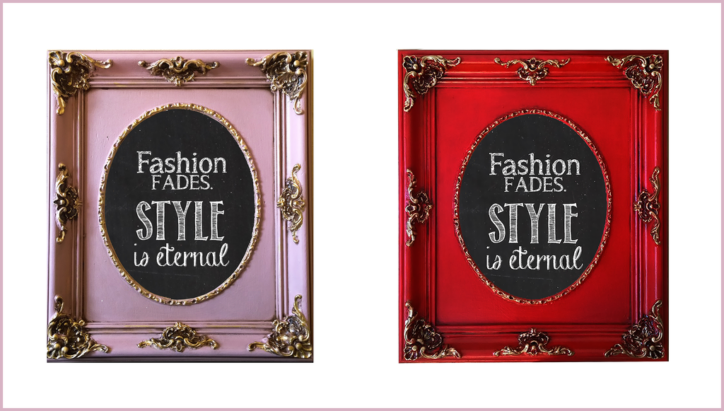
For these frames I had in mind to use them as chalk boards, so I ordered some 8 x 10 glass panes from a nearby store. I applied primer to the panes and applied one layer of chalkboard paint. The finishing product? Fantastic!
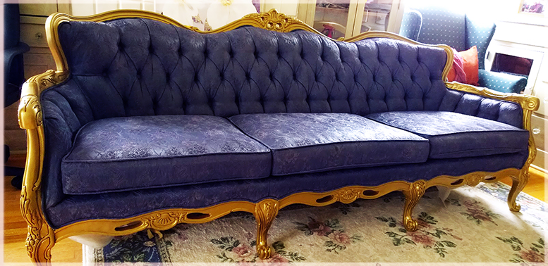
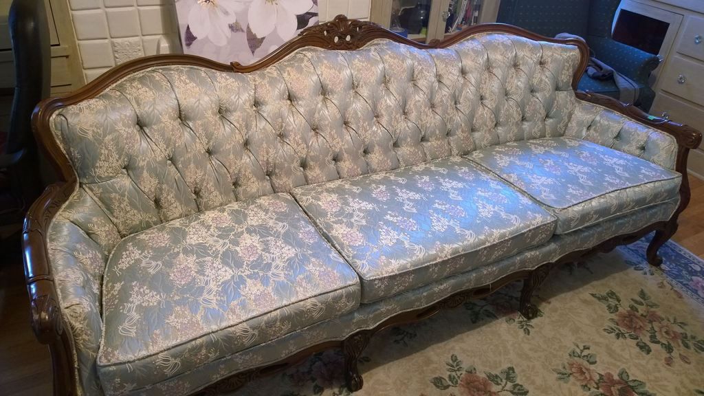
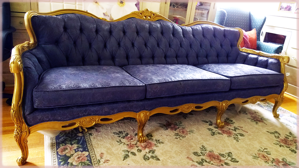
I was browsing Craigslist a week ago and found this gorgeous beauty. The previous owner passed away and left her estate to the children; the kids were frantically trying to auction off 6 acres worth of furniture all awhile trying to take care of their ailing father. When I saw this sofa it was still wrapped in plastic, hidden away in a storage unit at some dark lonely place in Long Beach.
I absolutely LOVE Victorian furniture, it brings back memories of my childhood; days where I would cuddle on the sofa with my mom watching Gone With the Wind. I am a girly girl at heart, and it never occurred to me that I would one day work with furniture. I still feel that anything can be feminine as long as you add your womanly touches to it. ♥
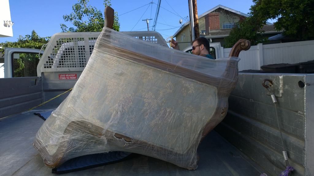
So I managed to strike a deal with the woman who sold me this piece, my husband had that Friday off so we rented a truck at the Home Depot. YES you can rent a truck there and for a much better price than U-Haul. I absolutely hate that U-Haul had a million different fees that they don’t tell you about until AFTER you’ve returned their truck. Sometimes those costs can reach triple digits if you’re not careful, and don’t even think to call their Headquarters to file a complaint…you will be ignored and ridiculed. I will never work with U-Haul again.
So the deal with Home Depot is that you pay them a deposit fee of $50, and they charge you $20 for the first 75 minutes and $5 every 15 minutes after that. This is all taken out of your initial deposit, and anything that isn’t charged will be refunded. It took me a little over an hour to relocate my sofa from the storage unit to my house and it only cost us $20!
The husband packing up our sofa!
My plan with this sofa is to paint the wood in ivory and the fabric in a dark blue or violet. I knew going into this project that it’ll be extremely intimidating, but I figured the challenge will be fun. I never once painted on fabric before, so I wanted to be real careful with my first attempt. There are so many fabric paint tutorials out there so the real challenge was to shop for colors. It was supremely difficult to imagine what a small swatch of paint would look like on a large 3 person sofa.
Red Bull and paint chips, just another day!
I didn’t want to use chalk paint on my fabric, I was too afraid that the chalky hardness would ruin the damask/embroidered surface. I decided on water based latex paint. My color? Knighthood by Behr.
Behr’s Knighthood
I absolutely fell in love with this color, it goes on like a soft navy blue with purple and brown undertones. I used a satin finish and it really brought out the shine on my fabric!
The process is pretty straight forward, here’s what I used:
♥ 2 quarts of paint. You NEED at least 2 quarts, probably more.
♥ A good paint brush (don’t use a cheap brush, trust me)
♥ Painter’s tape ♥ Fabric medium or hair conditioner (more about this below)
♥ Spray bottle filled with water
This was the only fabric medium I could find at Joann’s. This created lumps in my paint!
I could only find a few bottles of medium in my area, so I painted the back of the sofa without it.
My method was 2 paint : 1 medium : 1 water. Mixed into a container.
The color was lovely, and went on very smoothly.
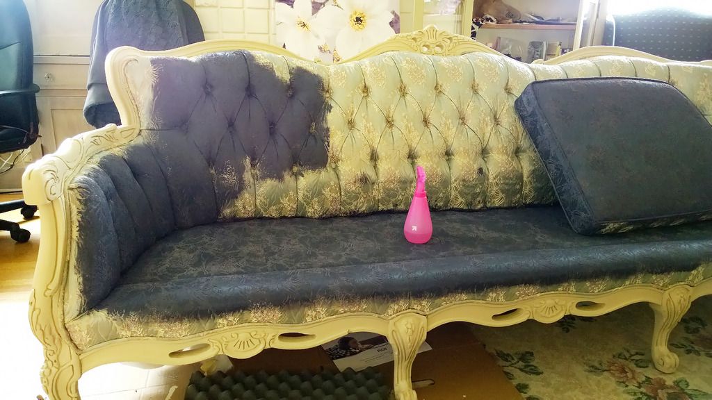
I am not sure why, but the fabric medium I used created large lumps in my paint, sort of like corn starch when added to hot water (it won’t dissolve!). I didn’t notice at first but when I started to apply the paint, the lumps broke apart and created little white stains on my fabric! It was frustrating because I didn’t want to waste an entire quart of paint. I applied it anyway, and hoped that the second coat will make a nice cover up.
Start in an inconspicuous area first, this is the initial coat.
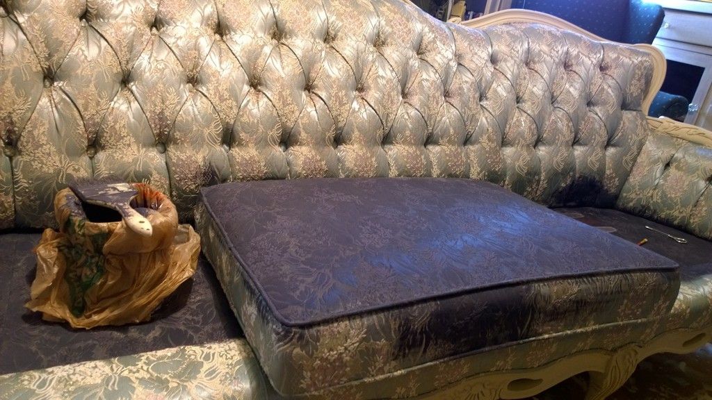
The paint actually saturated my sofa so well that I didn’t think I would need a second coat. Depending on the fabric of your project, it could take up to two or three layers of paint! Don’t be discouraged though, the end result is totally worth it.
Since my disaster with the fabric medium, I decided to substitute with regular hair conditioner. I bought something cheap and colorless at my grocery store and mixed it in with paint and water. I don’t know what to tell you, the result was amazing! It really softened up my sofa and didn’t leave a “crackle” effect.
I waited 24 hours after the initial coat. I didn’t think it needed a second layer but I applied one anyway just to cover up discolorations created by the lumpy fabric medium.
I then used soft wax over the entire thing to seal it up!
This took me approximately 3 days of drying and painting to complete. I did not like the Old White combination with this navy color so I repainted the trimmings in burnished gold by Ralph Lauren.
I repainted the trimmings in burnished gold.
Overall, the chair is a huge improvement over the original. I made a lot of mistakes along the way, (such as not double taping along the edges to prevent bleeding) but overall the attempt was totally worth it! Would I ever do this again? Probably not on a project of this size, it was nothing short of exhausting. My arms felt like they were going to fall off haha. The MOST difficult part of this sofa were definitely the buttons/creasing and the edgings. I think it accounted for the majority of my time and frustration.
Either way, I taught myself a few things and learned from my mistakes; that’s the whole point right? I can’t wait for my next project!
Here is a list of mistakes and lessons learned along the way:
1. Use a good quality brush, I started off using a cheap brush and this was a mistake. I figured I didn’t want to ruin one of my best pieces but honestly it really helps the paint get into those pesky little areas. Apply with pressure in a circular motion.
2. Spray and spray some more. Water that is: the damper the fabric, the easier it is for the paint to spread and absorb. Don’t fall short on this step!
3. Use hair conditioner if you can’t find fabric medium, it softened up my cushions and made it feel like leather. I couldn’t tell the difference between the parts that were painted with medium and the parts with hair conditioner.
4. I used a satin sheen and I love it, the shimmer gave my cushions a nice luster comparable to its original form.
5. Use painter’s tape and lots of it. I wish i could have gone back and double taped my edgings because some of the paint DOES seep underneath. It’s a huge pain in the rear to take off your tape and find that the color has bled on to the fabric! This is a total problem because painting over painted fabric is a huge chore.
I love coffee, but I am a major wuss so I settle for novelty brands (Baskin Robbins’ Cappucino Blast…mmmm). My husband can attest to all the situations in which an argument has subsided with one phrase: “Let me get you some coffee”. He is a dream, no wonder I married him ;).
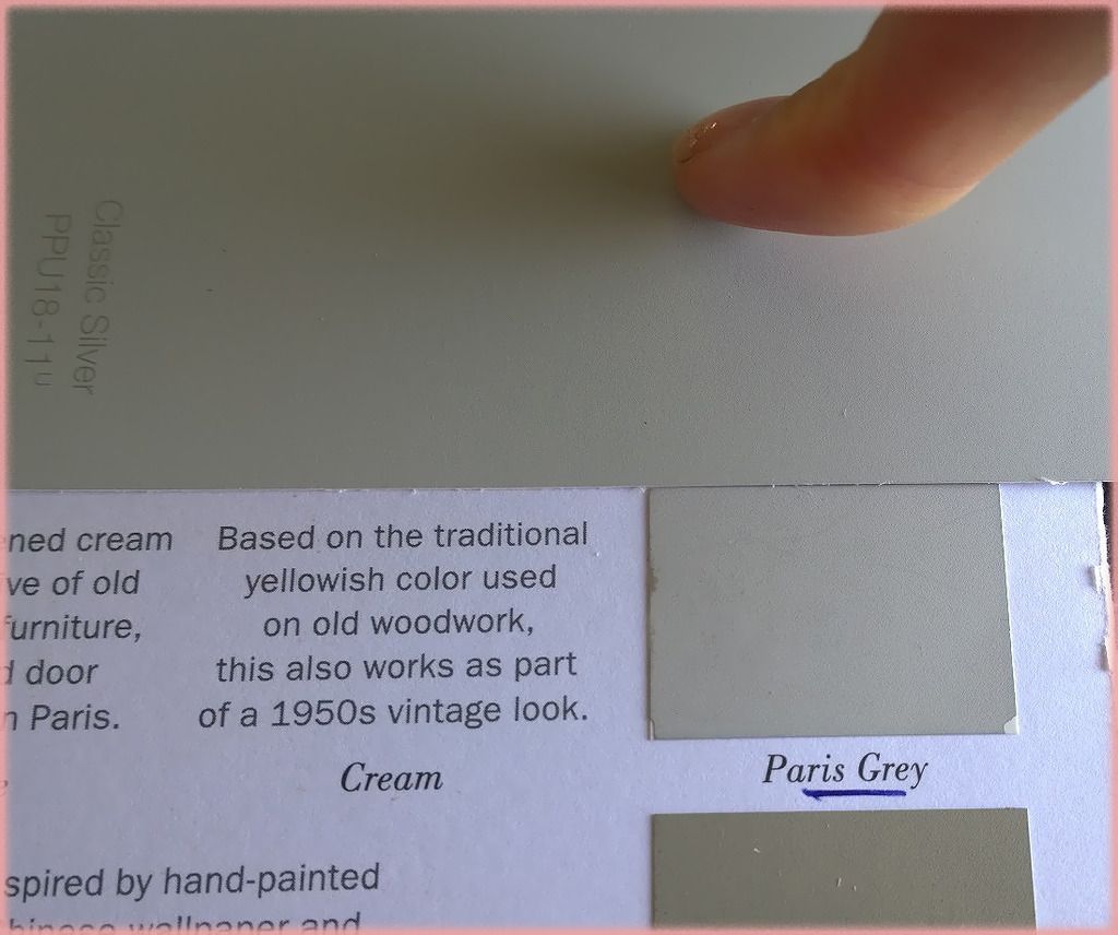
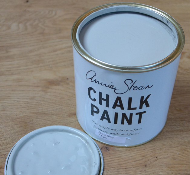
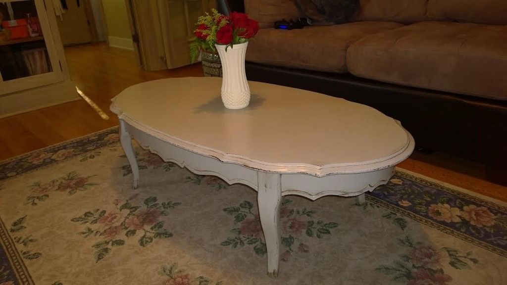
Today, I wanted to share a coffee table that I painted with Annie Sloan’s Paris Gray.
I compared this color with Behr’s Sparrow according to this chart here. It turned out to be a perfect match! Now I know where to get ASCP colors without the price tag.
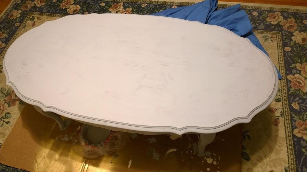
On with the story, I found this table on Craigslist for $20. It was initially meant for my living room, but upon seeing it in person I found out that the table was too short.
I decided to take her home anyway, because i knew she had potential. Plus her curves were too pretty to pass up.
I decided to mix some of the Paris Gray with Old White because I wanted a delicate grayish cream color.
It went on so beautifully! A very light grayish blush.
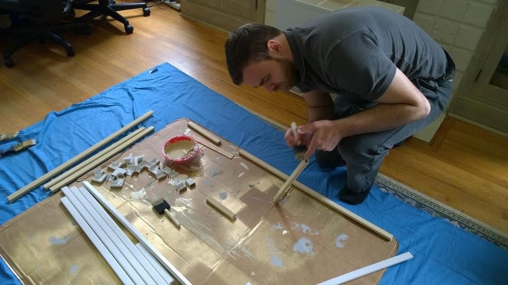
It’s so funny because during this entire time I got my husband to paint some of the wire tubings that we recently purchased for our place. It was a fun bonding experience, who’d knew?
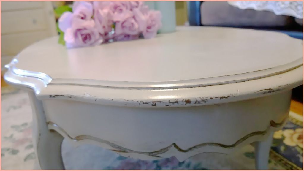
Since chalk paint dries so quickly, I was able to distress her within one hour.
I used 220 grit paper and started to sand while the paint was still soft.
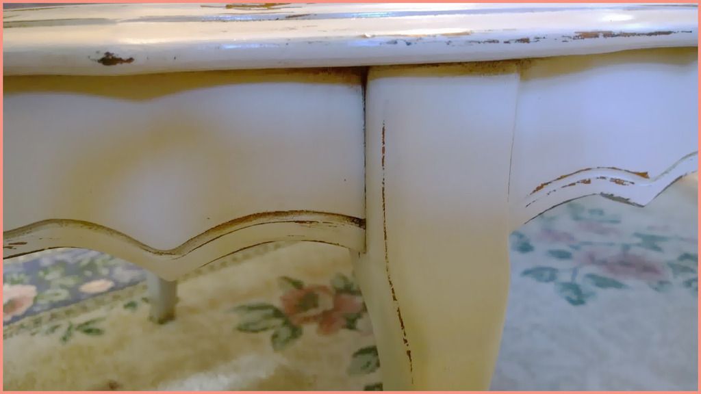
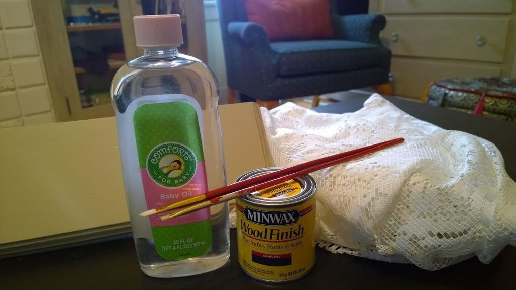
So at this point, I wanted to try something a little different. I read on this blog, that you can use baby oil and wood stain to achieve a distressed look while maintaining the original color. Let’s just say I tried this technique and it was a major disaster for me.
I had no idea how much stain I needed to apply, how long to wait between wiping, and how much to remove. Either way, I will probably try this method again but with a lighter stain color.
Beginner Tip #1 NEVER.. EVER sand your table in a circular motion. I made this horrible mistake when sanding the edges of my table, and after using the stain, it crept into the wood and left a dark gray color that is very noticeable! Always sand in the direction of the grain, I don’t know why I didn’t do this to begin with.
Beginner Tip #2 Unless you are going for a super chippy look, try to hold off on over-sanding and distressing. The results could be disastrous and unnatural.
Seeeeeee? See what happens when you go overboard? It looks unnatural.